Pages

Friday, April 29, 2011

Easter Egg Watercolor Paintings


Young students often rush to complete projects.  I designed this project as a way to slow them down.  Watercolor is a difficult medium and requires patience.  My second grade students were excited to create their own watercolor Easter Eggs and did a fabulous job.  My posting is a little late but they are beautiful!

Materials: 
8 x 10 inch watercolor paper
watercolors
pencils
water dishes
paint brushes
examples

Making our Eggs:
Our first class together we discussed Easter Eggs and creating designs and patterns on them.  The students had a choice-they could draw one egg or two.  The eggs had to have a pattern or design on them.  I reminded them not to draw small because we would be painting.  I also asked them to include some grass (as if it were in a basket).  Some decided to personalize their eggs a bit more.

During the second class, we discussed watercolor techniques and I demonstrated how to work with the watercolors.  Watercolors require water in order to work.  Although this may seem obvious to most adults sometimes children forget to add water when they are painting.  So we talk about using the right amount of water and how to keep our brushes from having "bad hair days".  The students always think this phrasing is hilarious!

The students spent the next 2 classes painting their eggs.  A few wanted additional time and came in during our early morning tutoring time to work.


by Annie


Printmaking Zoo Shirts


Every year our first grade classes study habitats and animals.  After all of the studying, they have an opportunity to go to the zoo and see the animals up close in their habitats. 

In the art classroom, we create Zoo Shirts using the printmaking technique of stamping. 

The children love this project and are so excited to create their shirts.  On the day they visit the zoo, they all wear their shirts.


To make the shirts you will need the following materials:
Acrylic paint (or fabric paint-something that is permanent)
Paint brushes (various sizes)
Stamps (home made or purchased)
Styrofoam trays or egg cartons for the paint
Aprons or art shirts to protect clothing
T-shirt forms to put between the shirt and protect the other side


Here is how we make our shirts:

1. I place each shirt on a t-shirt form to help make the printing easier for the students.  If you don't have a t-shirt form use a heavy piece of oak tag, poster-board or cardboard.

2. I demonstrate for the students how to paint the surface of the stamp with the acrylic paint.  We talk about having the right amount of paint on the stamp so that we get a good print.  Too much paint or too little and it won't turn out well.  We agree that a nice even coat of paint with out drips works the best.


3. Next you can actually print the stamp on the shirt.  Find the right spot for your stamp and gently press down on the shirt being careful not to move it.


4. Off to the next stamp and the next colors. Repeat.


5. To stamp the other side of the shirt you will need to allow the first side to dry.  Then you can do it all over again on the other side.

6. Proudly wear your shirt and go visit the zoo!

Please note, if you use acrylic paint or permanent fabric paint you can wash your shirt as normal.

Monday, April 25, 2011

Thiebaud Inspired Cakes

One of Wayne Thiebaud's cake paintings.


Wayne Thiebaud is known for his paintings of delectable treats!  The students always enjoy this project and the idea of creating their dream cake.  We often talk about the cake shows that are on TV these days: Cake Boss & Ace of Cakes. The students dream up their ideal birthday cake and create beautiful paintings.  This is a great lesson for talking about color mixing, practicing ovals and 3D images.

Materials:
Examples of Wayne Thiebaud's work
Water dishes
Paint
Paint Brushes
Pencil
Sharpie markers (optional)

How to make your own cake:
1. Begin by drawing your cake.  Start with an oval and then draw a line from the edge of both sides of the oval down toward the bottom.  Connect these two lines with a gentle curve to make the bottom edge of the cake.  Add another layer if you like. 
2. Add a background by drawing a line across the back of the paper to separate the table from the wall.  You can also think of this as the sky and the table -if your cake is outside.  Don't draw the line through the cake; cakes are not invisible ;)
3. Add some details to your cake and background such as: candles, designs or patterns, a striped wall, a tablecloth, etc. Be creative!
4. Now you are ready to paint!  We start with the background.  Paint the wall and the table first and then paint the cake. 
5. If you want to outline all of your pencil lines with a sharpie.  This helps define the image but isn't necessary.
6. Display your delectable cakes and enjoy.  Maybe go home and make a real cake too!


Thursday, April 21, 2011

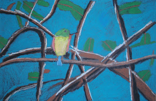
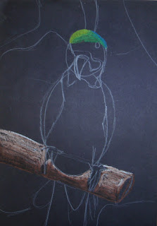
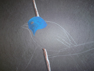
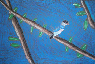
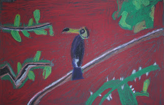
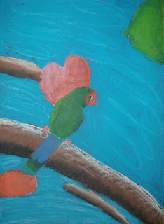
Oil Pastel Birds

By Jaden
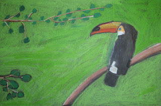
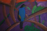
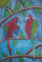
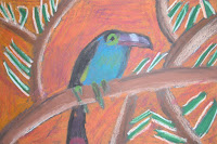
Students in 4th grade classes learn how to blend colors, shade and examine objects for simple shapes.  Oil Pastels are easy to work with and allow for easy blending.  This is the second year that I have done this project.  

Materials Needed:
12 x 18 inch Black Construction Paper
White Colored Pencils
Oil Pastels
Images of Birds (I print out about 30 or 40 and then laminate them so that we can use them over again)

Drawing your bird & using oil pastels:
  1. We begin by looking at the images that I have printed out.  I ask the students if they can identify the simple shapes in the images.  Birds are wonderful for learning how to draw and looking for basic shapes.  The main shapes students always see are circles, rectangles, triangles and ovals.  They point out the part of the bird and the shape that they think is the closest.  
  2. Next, I demonstrate how to draw the bird using simple shapes.  I start with the body (oval) and then the head (circle).  Next is the beak, usually a triangle.  The tail feathers are usually rectangles.  I map these out using just the basic shape. 
  3. Then I go back over the shapes and begin to soften the edges and try to make the shapes blend together.  
  4. Finally, I add the details-- the eye and wings.  I also draw in the color changes.  
  5. Now we are ready for the oil pastels.  We use Crayola Oil Pastels.  We talk about color and examining colors a bit more to determine if the color is the same as the color out of the box.  The students always agree that the colors in real life are always a mixture of colors and not just the colors we see in a box.  So we begin with a base color.  Perhaps our bird is blue. We use one color of blue as the base and then build upon that with a lighter or darker blue, looking for the highlights and shadows.  
  6. We do the same thing with the branches- start with a base  of brown and then add white for the highlights and a little black for the shadow.  We also talk about using complementary colors to create shadows.  
  7. Next we color the leaves, flowers and plants.
  8. Our last step is to color in the background.  
  9. The students spend about 2-3 forty minute classes on their birds. 
Every year I am impressed with how well they can break down an object to find the basic shapes.  They are always pleased with themselves and proud of how beautiful their birds look.


This is one of my examples-showing the basic shapes & blending.

Example showing shading and blending.

Student created bird.
By Alex
by Kaqu
by Kameran
by Devin

By Zach
By Donna

Wednesday, April 20, 2011

Recycled Art- Flowers for Mother's Day

Made with scrap booking paper.

For Mother's Day this year we are making recycled art flowers.  These are adorable and so easy.  This is a wonderful way to talk about Earth Day and recycling too!

Materials:
pipe cleaners
buttons
hole punch
strips of magazines (glossy paper) about 1/2 inch to 1 inch or strips of scrap booking paper- I use 1 inch by 8 inch strips or longer
(I love National Geographic magazines for this project because the pages are very glossy.)


Here is how to create your beautiful recycled flowers:
1. Take about 5 strips and punch a hole in the middle of each and on the end of each about a 1/2 inch in. You can use more if you want a fuller flower.


 2. Thread the paper into the pipe cleaner starting with the middle hole and then gently folding over the two ends.  Repeat with each strip, layering.


3. Thread the top of the pipe cleaner into a button and back down through the hole punches.


4. Twist the pipe cleaner around itself to keep the paper from sliding down.


5. You are finished.  Make a bunch to give to your mom and show her how much you love her! 

This one is made from recycled magazines. 
Also made from magazines.


Wednesday, April 13, 2011

Picasso Style Portraits


This is lesson is based upon Picasso's portraits.  Pablo Picasso is famous for abstract art and cubism. In class we discuss the difference between ABSTRACT ART and CUBIST ART.  Here are some of the differences...

This is an example of a CUBIST style painting created by Pablo Picasso.
This is called Factory, Horta de Ebbo:

Here are some characteristics of Cubism:
  • Little detail.
  • Limited palette of colors.
  • Images tend to look flat.
  • Use of geometric shapes.
 ----------------------------------------
 This is an ABSTRACT piece by Pablo Picasso called Portrait of Dora Maar:


Here are some characteristics of Abstract art as compared to Cubist art:

  • Distorted or changed shapes but objects are still recognizable (sometimes objects are not recognizable); not an accurate representation of an object
  • more use of detail
  • More use of color not necessarily realistic color
-----------------------------------
We create our own Picasso Style Portrait in a COLLAGE format.  Collage can be defined as using parts of other images to create a new image.  Typically we use various types of paper to do this: newspaper, magazines, photographs, tissue paper, etc.

An added note: My student teacher last year (Miss Jones) designed this awesome lesson!  Thanks Miss Jones!


Teacher Preparations:
I prep the materials by tearing out numerous images of faces from magazines.  I look for large images of faces- the bigger, the better. (I do this simply to eliminate the students from getting distracted by the magazines.)
I also use a template of a head and shoulders that the students can begin working with, thus ensuring an image that isn't tiny.

To create the portrait I ask the students to do the following:

  1. Cut out two different eyes-perhaps one is bigger than the other.
  2. Cut out a nose.
  3. Cut out a mouth.
  4. Please note: we don't concern ourselves with the images being male or female.  In fact it makes the picture even better if the images are from males and females. 
  5. Once the facial features are cut out, then we glue them onto the head.  It's okay if they are not exactly in the correct place.  Turn the eye side ways or move the nose down or off to the side.  
  6. Next, look for hair to cut out.  Pick out hair from different images and then glue them down to create one.
  7. Now, using your pencil add a neck line and some details to the shirt.
  8. Color in using crayons, colored pencils or markers. We use crayons.  
  9. I do ask the students to use a skin tone for the face and two different colors for the shirt and background.
  10. Admire your newly created collage faces!  The students love these.